This Merchant Quarter project involved creating a brochure for a new property development. In addition to this we needed a client document that contained a hoarding design and examples of advertisements that are used to promote the scheme. The project involved creating a brand identity using a logo, imagery, colours and typography to form a design appropriate for the subject.


This logo is a reflection of the letter M and the structural design of the building. With the modern nature of the building suiting the sans serif M and the height of the accommodation. This decision was based on detailed research into the surroundings and the distinctiveness of the properties. My brochure features a range of turquoises and large white spacing. This is to produce a clean and fresh new look; it also encourages the reader to focus on the imagery and typography within the brochure. The sans serif typography is contemporary and neat, linking to the rest of the design decisions to produce a cohesive design. The format is A4 making the design tailored to the price of the properties. The colour palette used within this document is based around a Nordic theme. With close proximity to the Thames and located near a harbour they link the branding well to the development.
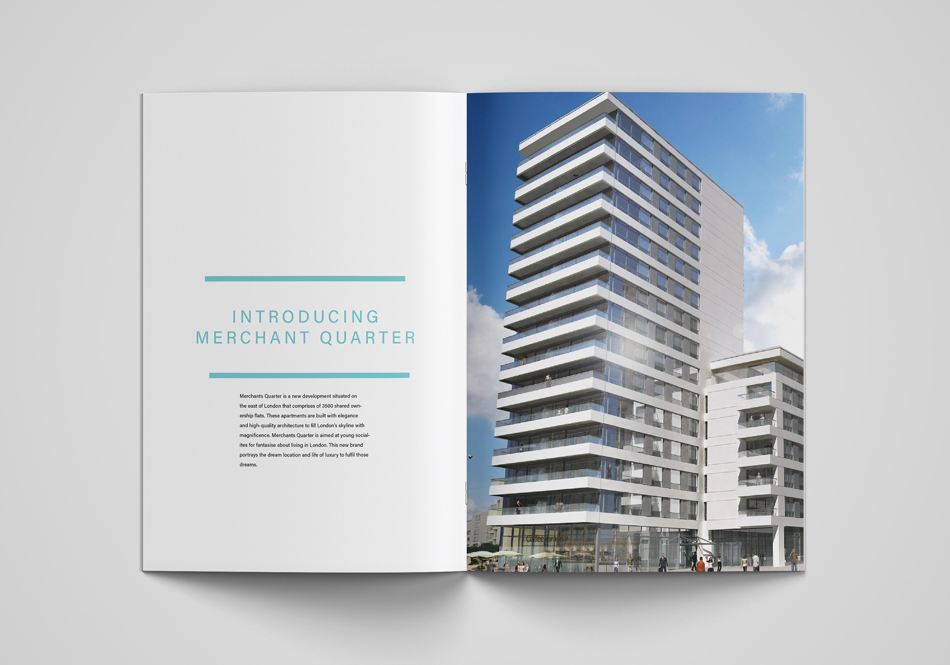

The client brochure outlines the design used within the main brochure as well as specifying the reasoning behind these decisions. The brand for Merchant Quarter also includes a range of complimentary objects to help promote the scheme such as mugs and notepads, these are also displayed within this document. The brochure is our key piece of advertising for the development, with high quality images, CGI’s, detailed specification. The viewer can be filled with inspiration and insight to what it might be like to be a part of this new community. With consistent colours and layout there is enjoyment in the comfort of owning one of these properties.
