The Loddon Catchment Partnership is an Organisation that brings together local people and other organisations to improve and preserve the environment within the Loddon River catchment area. As water resources are always high in demand the activity carried out by this partnership is important to the health of the ecosystem for now and the future. The partnership focuses on identifying and delivering projects that will help improve the waterways. This organisation runs on the help of the community as well as corporate funding.
The partnership required a new logo to represent the organisations values and to aid their professionalism when presenting themselves to corporate companies. Their main aims were to have a logo that reflects wildlife, community and the waterways, whilst having a serious image to their name. Therefore, the objective to unify these elements in order to produce a successful outcome. This logo was to feature on documentations, the website and promotional material; in future clothing. The scale of the logo will vary as it will be displayed on a number of platforms; therefore, versatility is crucial to the design. This project was taken on by Jordan Bellinger and I, as part of the Real Jobs scheme within the University of Reading.
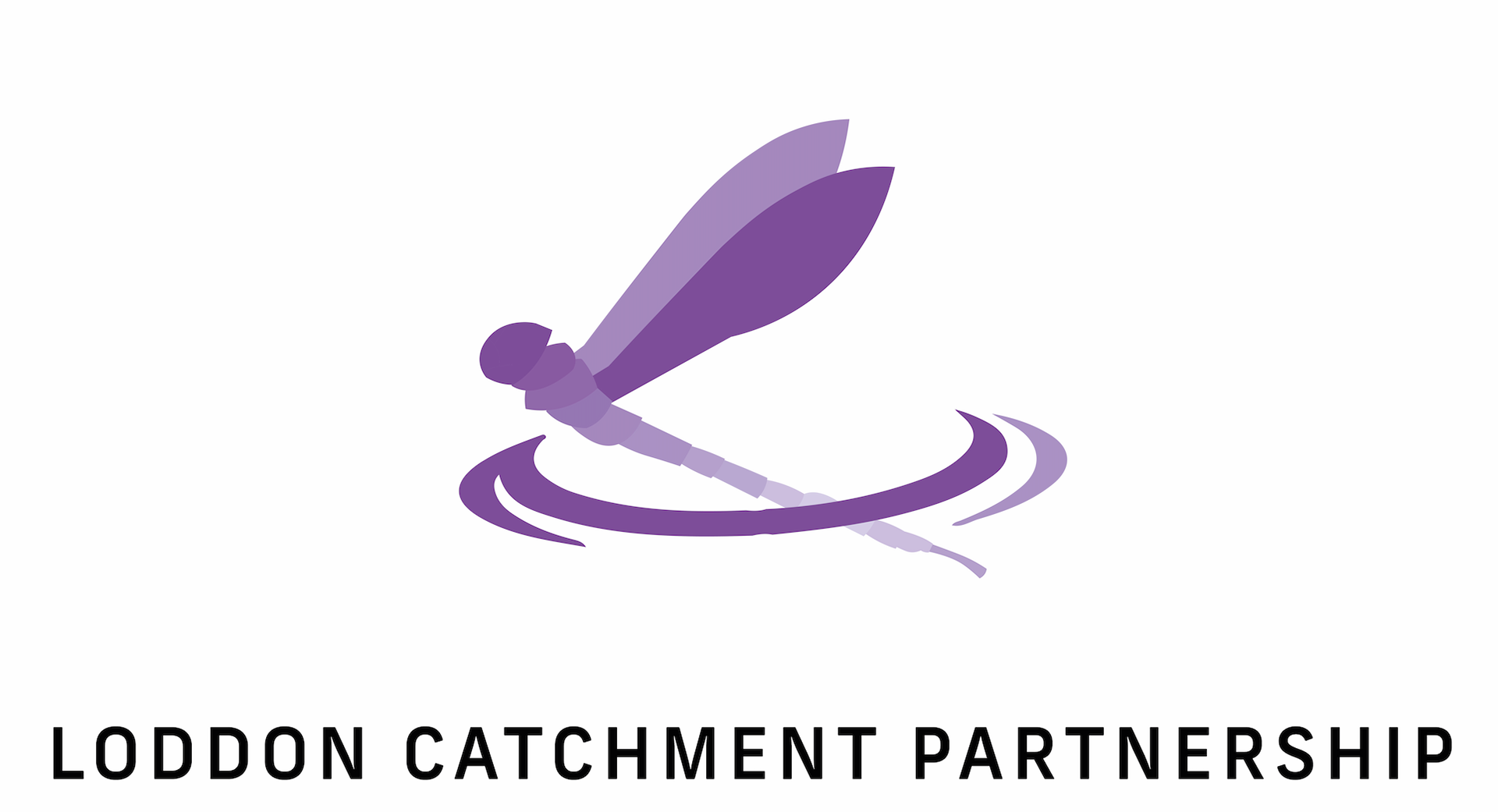
The logo conveys a dragon fly coming out of water in a number of different positions. The water is portrayed with a ring around the abdomen (the tail) of the dragon fly, with an additional half ring to help the interpretation of the image. The symbolism also depicts the idea of growth by travelling upwards and therefore the focus on future plans within the catchment. We explored different levels of detail within creating this and used photographs were extremely important to aid accuracy.