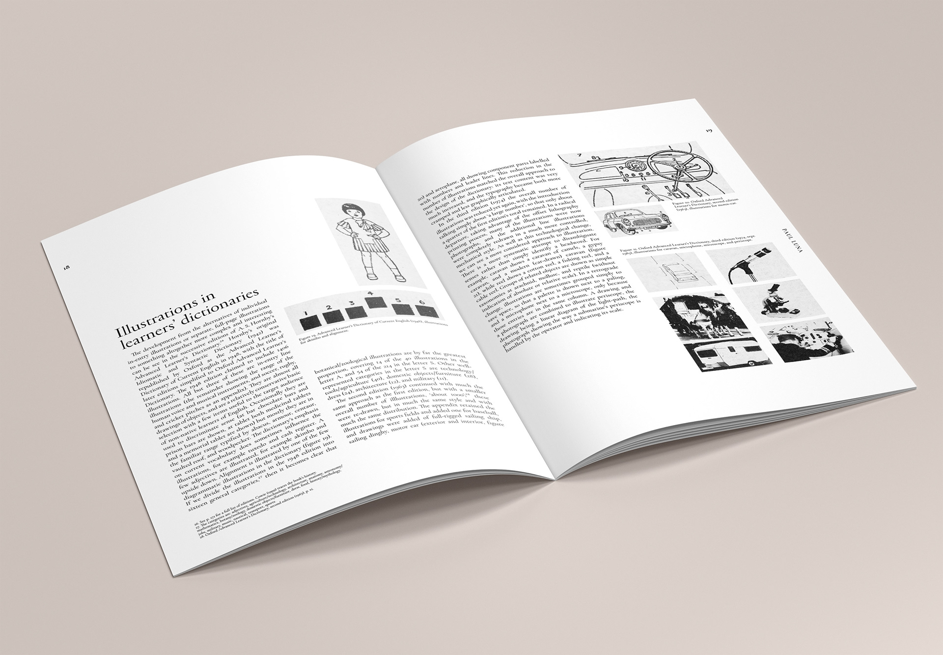
This project focuses on exploring how texts and images can be combined in a short publication. Emphasis is placed on developing and using a grid to present and flexibly organise content in order to achieve layouts that offer both consistency and variety, and which enhance the reader’s understanding of content. The publication was a piece of literature from the author Paul Luna on the topic of illustrations within dictionaries, this meant that it included a high number of images that correlated to the text. This project not only tested my editorial skills but crafting skills for the final mockup of work.
My approach to the project involved using large margins to allow for a comfortable read and a 4 column grid structure that the text and images were aligned to for consistency throughout the document. Careful cropping of images was needed to aid the readers upstanding and larger images that span across pages meant more detail could be observed. The typography had many variations for the different elements, such as footnotes, captions, running heads, headings and main text. These were all using variations Cormorant Garamond.
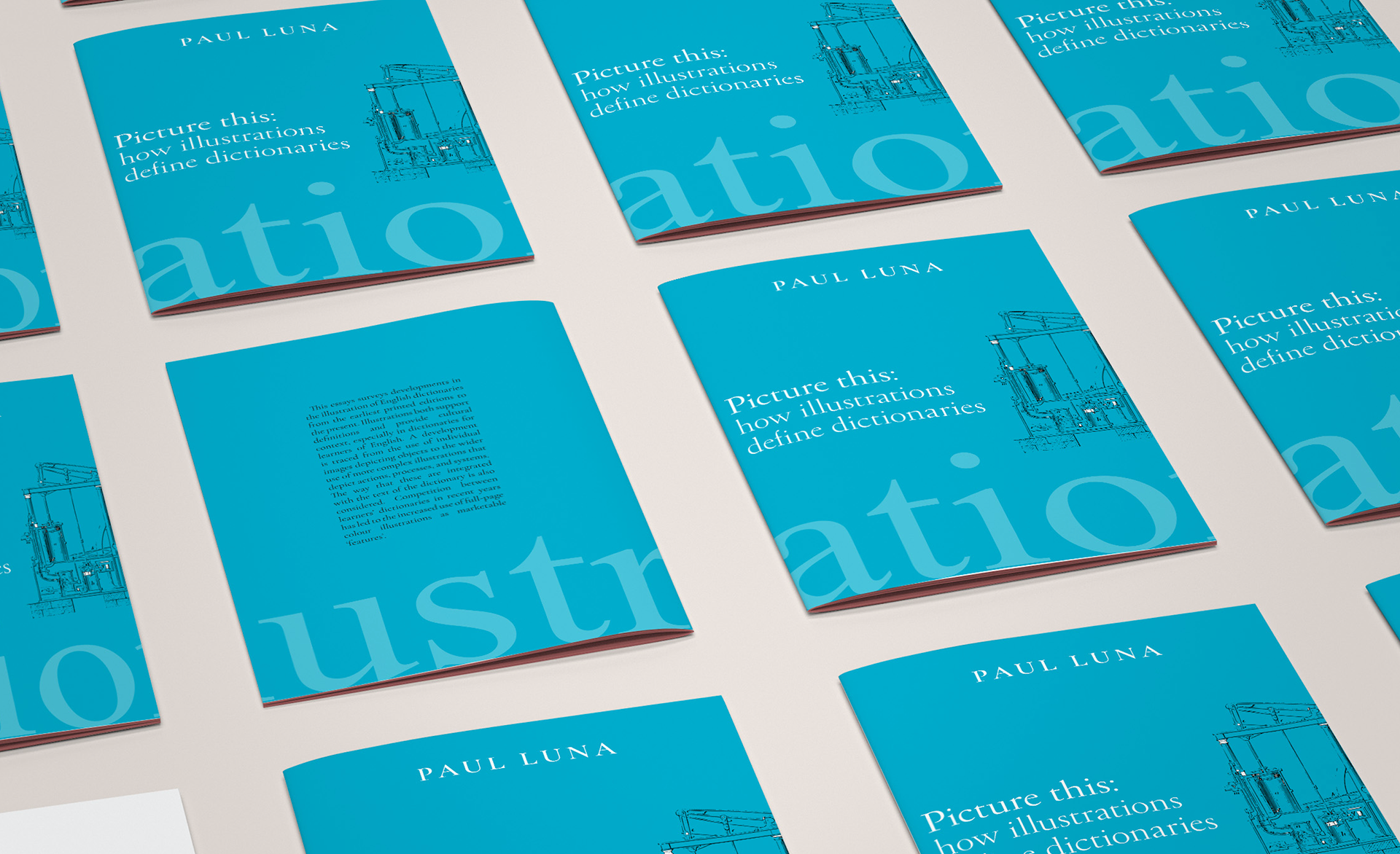
The word illustration ran across the cover and the back but allowed room for the title, author and one of the key illustrations within the article. The title and author were set in a serif font to keep the traditional feel of the document. The cover was a cyan blue with a lighter blue used for the word illustration to make the composition more subtle.

The cover was held onto the book using flaps and the rest of the book was stapled together.
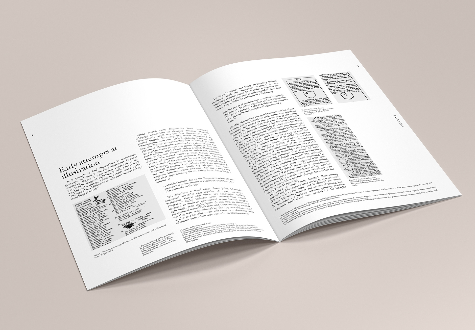
All text and images were aligned to the grid for consistency and the size on the image depending on the content, its importance and the overall design.