Dent is a student mental health magazine that helps you to combat those darker days. It highlights that you’re not alone and provides ways of coping through tough times, containing articles that can relate to many. Although mental health may be present within you, it’s just a dent.
The name Dent arises from a number of meanings: being marked by a pressure, when something is misshaped and the ending to the word ‘student’.
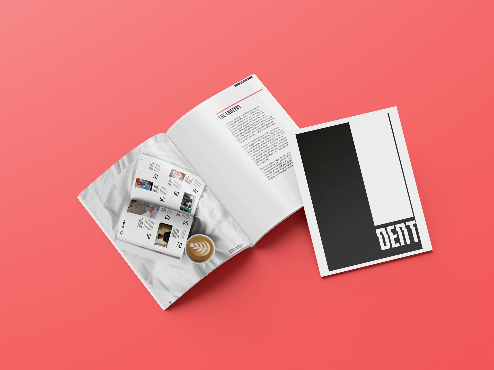
This idea came from research that showed that more than one-fifth of people have a current mental health diagnosis. It also showed that there wasn’t enough support or help being given out. All content of the magazine aims to increase well-being as well as confidence, knowledge and broaden the mind to new ideas, without being over baring or suggesting damaging change.

Dent provides articles to assist readers whilst conveying the seriousness of the topic. This is illustrated through the choices of imagery and typography. The topic itself is so versatile so without pushing new behaviours it aims to inspire new thoughts that people can use to their own advantage.

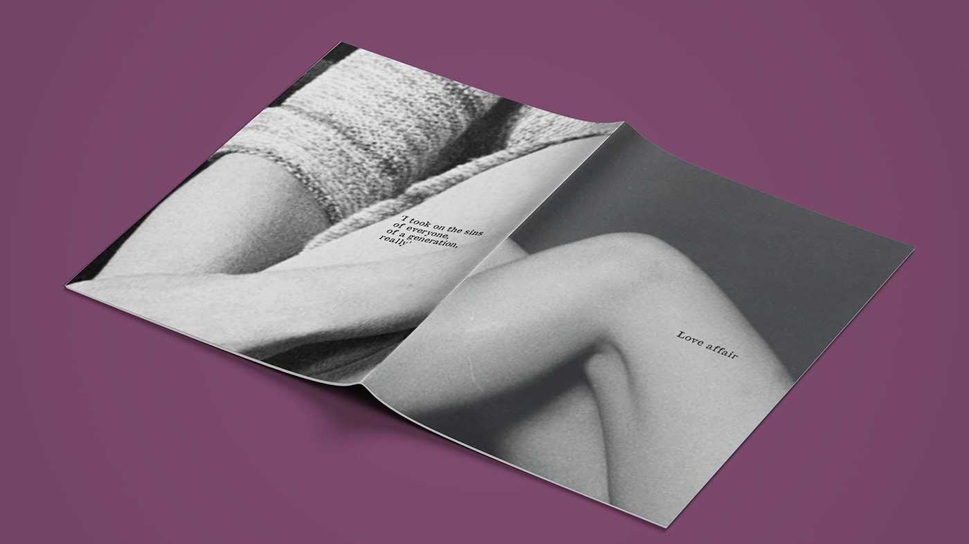
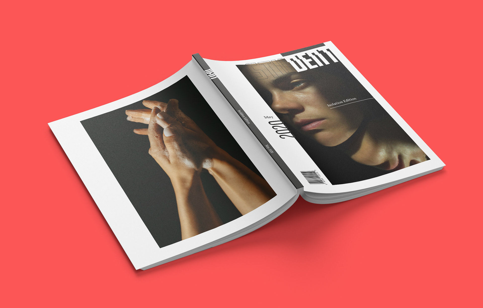
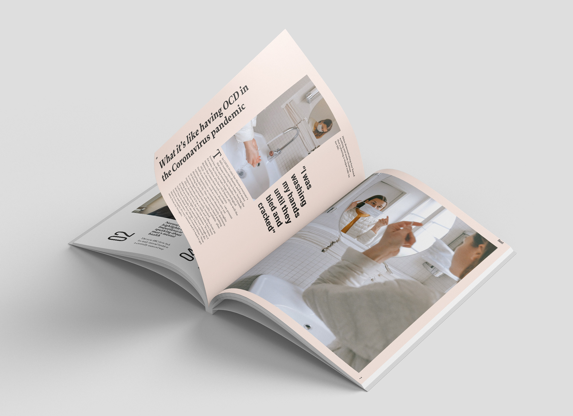
The images are a fundamental part of the articles and aid imagination and understanding of situations. The images include portraits of students looking into the camera, making the article feel personal and familiar. Content includes stories, listings and articles, this allows a different perspective to be conveyed through the magazine. The typefaces are strongly contrasting. One being a serif font that is enjoyable for long reads and getting lost in the thoughts and perspectives of others. Whereas, the sans serif is condensed and tall, yet easy on the eye. These fonts together create a dynamic relationship but are used comfortably together to differentiate articles and stories.

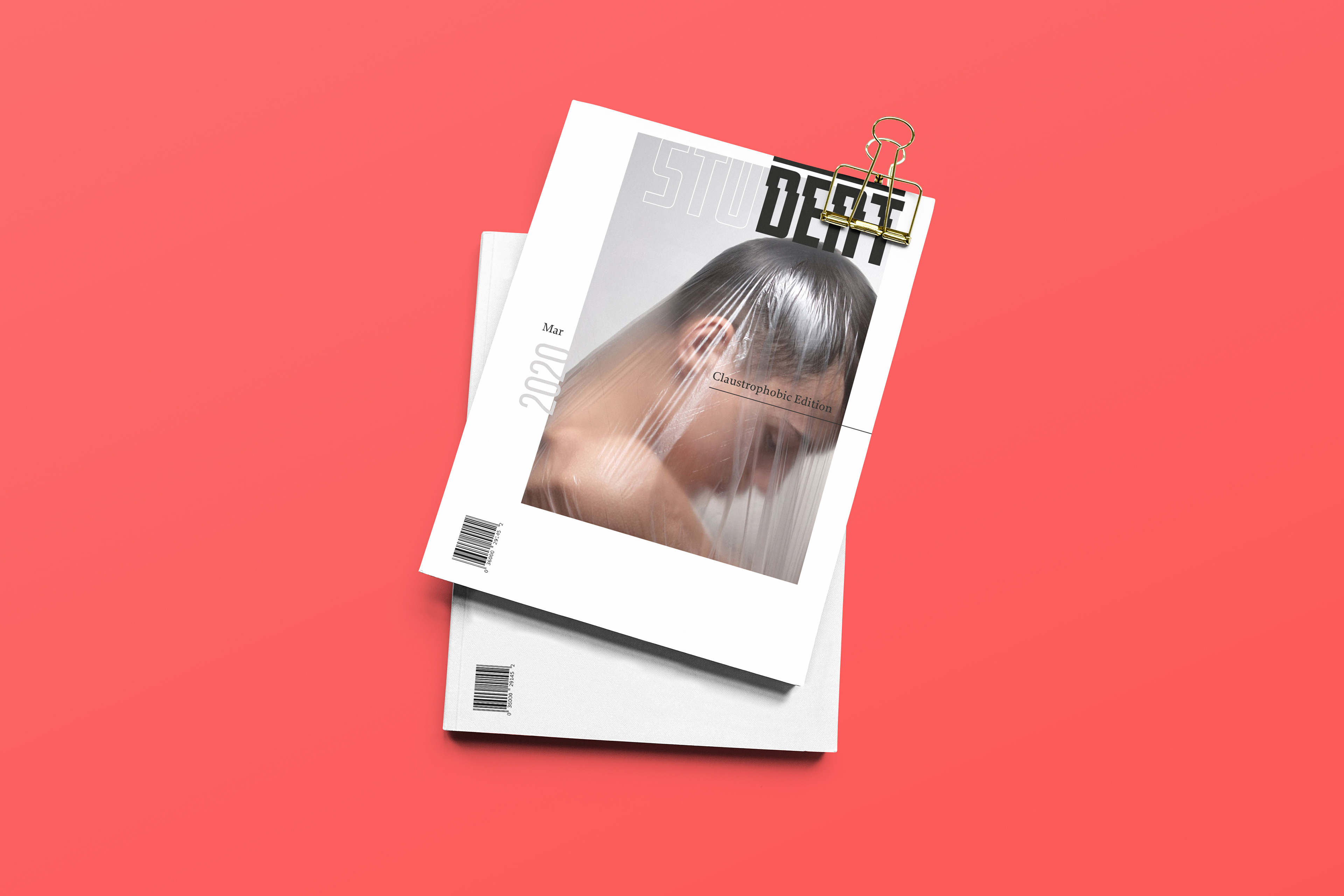
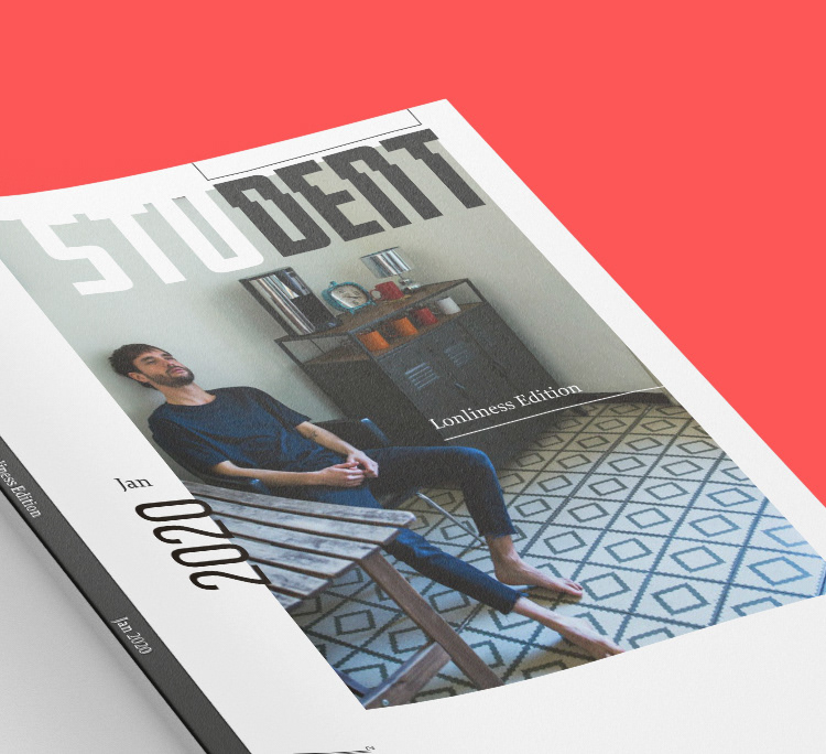
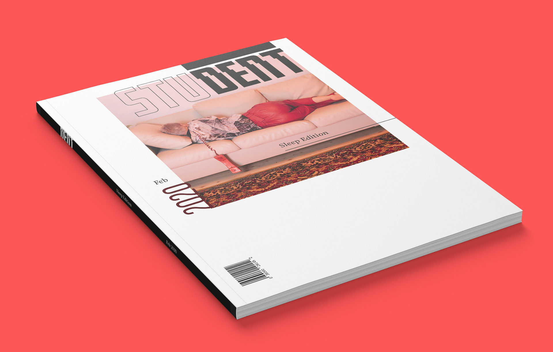
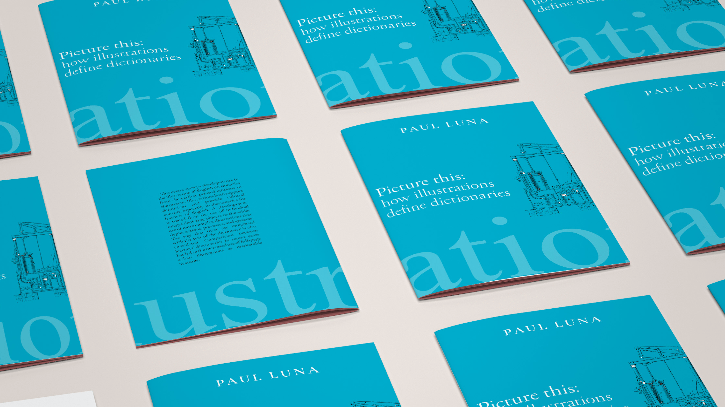
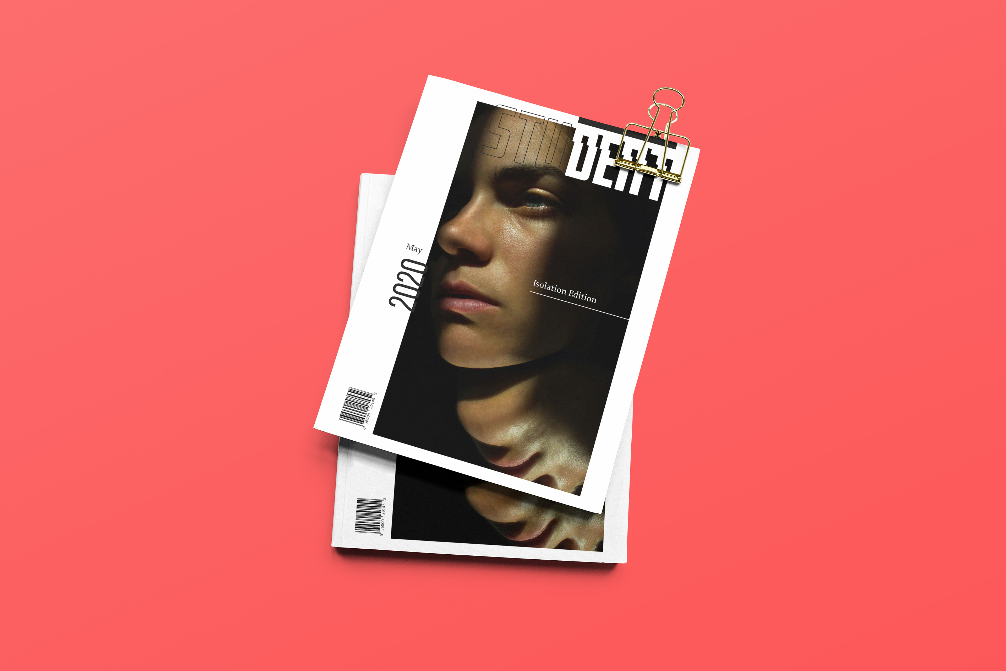
The collection of magazines covers a range of different imagery that reflects an artistic approach to mental health. These covers increase intrigue and the obscurity making the designs appealing. It also avoids glamorising mental health and reflects an image people can connect with through understanding what it's conveying. All covers feature the same white background and the main image ranges in size with the right margin remaining the same.
The format of the magazine uses a 4 column grid, allowing the main text to flow in 2 columns. The grid defines the location of the imagery and sits the elements neatly on the page. The gutter used is 5mm and helps provide space between the different components. This builds a spacious and open layout that follows the idea of peace and thought. This is outlined in the accompanying document shown below. This is the pitch document that describes the magazines attributes and its online presence.